01, Project Overview
KMS Fusion
Ontology Management Redesign
KMS Fusion is EY's knowledge management platform. I led a full redesign of the ontology creation and management experience, turning a fragmented, tab heavy flow into a single guided workflow that feels like a real enterprise product.
2026
Project timeline
↑ Active development
12
Screens redesigned
↑ End to end flow
Solo
UX/UI Designer on the project
↑ EY internal team
7
Steps in the guided flow
↑ From draft to publish
Lead UX/UI Designer at EY, responsible for the ontology management redesign from discovery to final screens. Worked closely with the product team and engineering to turn a confusing, tab based system into a clear, guided product experience.
Enterprise UXInformation ArchitectureUI DesignFigmaWorkflow Design
02, The Problem
A powerful system
that nobody could follow
The existing ontology experience was technically capable but confusing to use. Information was scattered across too many tabs, naming was inconsistent, and users could not always tell what action to take next.
01
Too many tabs, no single source of truth
Ontologies were split across separate tabs for Overview, Unpublished and Manage. Users had to hunt to find the item they were looking for.
02
Inconsistent naming created confusion
Terms like OpsConcept meant nothing to users. The same concept was labeled differently across screens.
03
Unclear primary actions
Screens had multiple equal weight buttons with no clear next step, leaving users unsure what to do.
04
A fragmented, step based flow
The creation process felt disconnected, with no clear sense of progress or what came next.
03, The Redesign Strategy
From scattered features
to one guided flow
The redesign centered on three principles: centralize everything in one place, give every screen a single clear action, and turn the creation process into a guided, linear journey.
Centralized ontology management
One single list for all ontologies, regardless of status, with smart filtering instead of separate tabs.
Consistent naming across the product
OpsConcept became Templates. Ontology Review became Review annotations. Every label now means the same thing everywhere.
One primary action per screen
Every screen has exactly one dominant action. Secondary options are visually lower in priority.
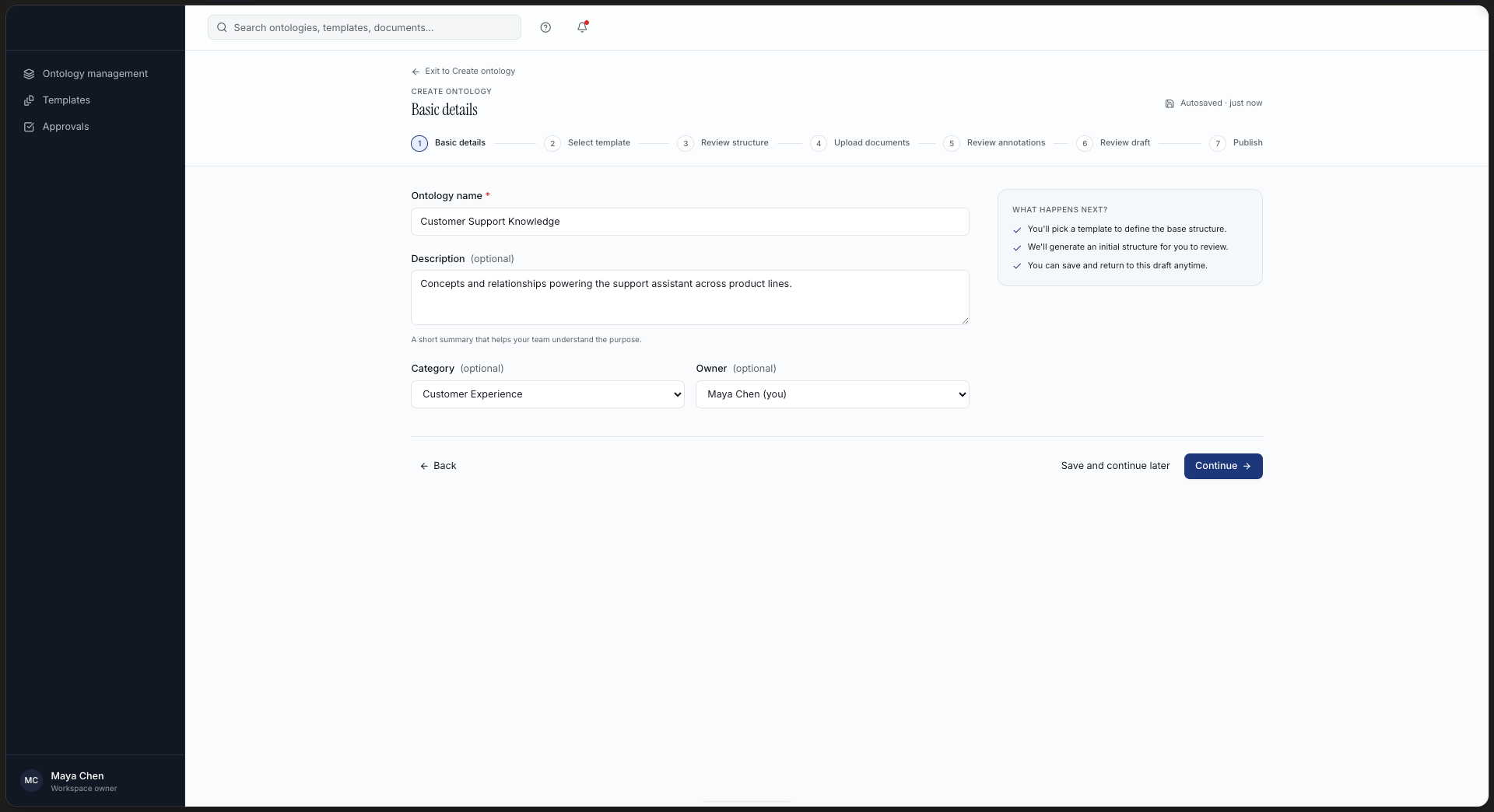
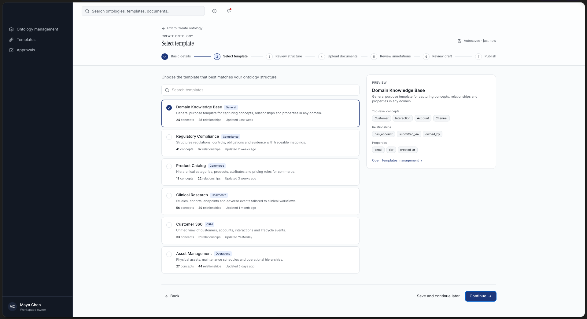
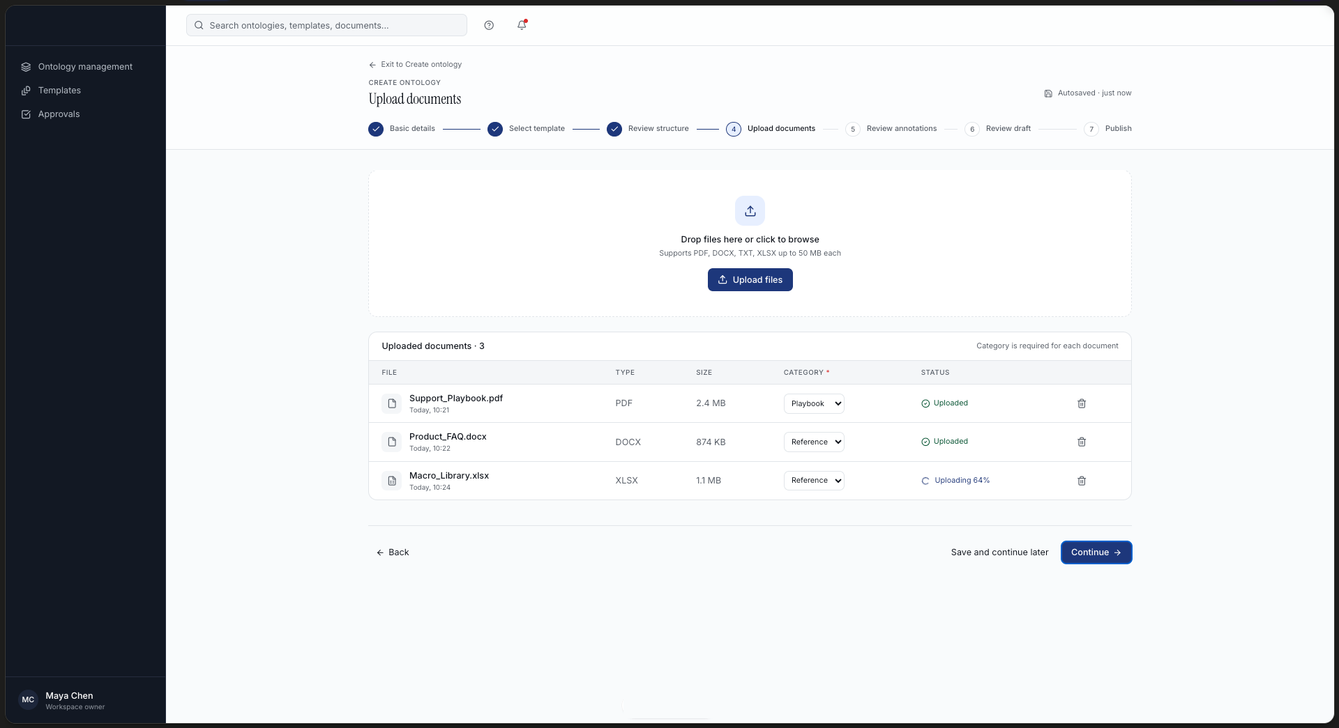
A 7 step guided creation flow
From basic details to publish, a clear stepper shows users exactly where they are and what comes next.
FlowBasic details → Select template → Review structure → Upload documents → Review annotations → Review draft → Publish
04, Screens
High fidelity
prototype
Due to an NDA, I cannot share the real product screens or other internal project details. The screens below are high fidelity mockups, recreated to represent the same design decisions, and do not use EY's Motif design system.
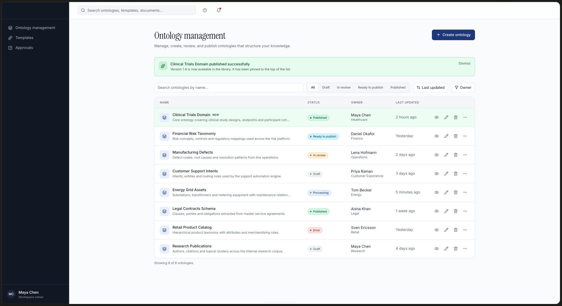
Ontology management, single centralized list with status pills and smart filtering
Create ontology, three clear starting paths, with the recommended option highlighted
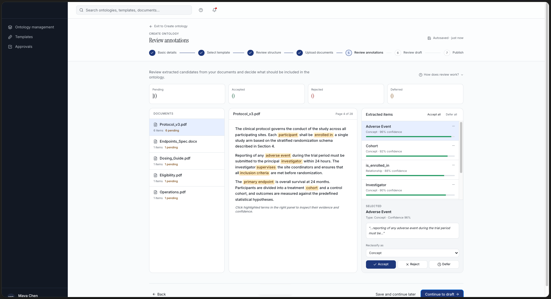
Review annotations, three panel layout for inspecting and deciding on extracted terms
Review draft, consolidated summary before publishing, with open questions clearly flagged
Publish ontology, clear confirmation flow with export options and status feedback
05, Key Improvements
What changed
for the user
Before
Ontologies split across 4+ separate tabs
Inconsistent labels like OpsConcept
Multiple equal weight actions per screen
No clear sense of progress in creation flow
Review screen felt static and overwhelming
After
One centralized list with smart filters
Consistent naming across every screen
One clear primary action per screen
7 step guided flow with visible stepper
Three panel review with bulk actions and clear decisions
06, Conclusion
Structure first,
complexity second
The biggest lesson from this project was that complexity in the data model does not have to mean complexity in the interface. Once the information architecture was right, every other decision became simpler.
"The platform did not need new features. It needed structure. Once I centralized the information and gave every screen one clear job, the whole product became easier to trust."
Otávio Bonato, Lead UX/UI Designer, EY